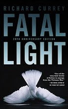
The final design for the often hilarious One Bird’s Choice. The subtitle nicely sums this one up. I needed to find a way of quickly relating the crux of the story while hitting the proper note and being cognizant not alienate too much of the readership by going too alt or indie even though the book has its leanings in that direction. After searching high and low for fitting footwear to represent the books main characters and the perfect welcome mat (a tough find, thanks Walmart) I set up this little still life (shot by Edward Pond). I fashioned a guinea fowl (that's the butt ugly bird on the cover who lives with Iain’s parents on their farm) footprint out of putty and stamped a trail of muddy bird prints leading from the back cover to the welcome mat. A subtle typographic detail; the two little red dingbat dots on either side of the author’s name are meant to represent his parents whereas the red apostrophe in the word Bird’s harkens Iain and the red a connection to the bird.


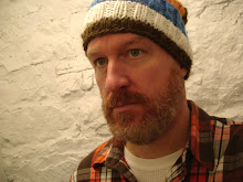
When I saw this photo of the author Iain Reid I immediately started laughing and chomping at the bit to make a fitting cover out of it. The photo, to me projected a classic portrait of a lost twenty-something in the 21st century. By using the type bar as a blindfold the author was obscured just enough. Plus Iain looked like he had just walked off the set of a Wes Anderson film. The treatment was ultimately deemed too “alternative” but it did lead to some typographic solutions that worked well on the final cover.